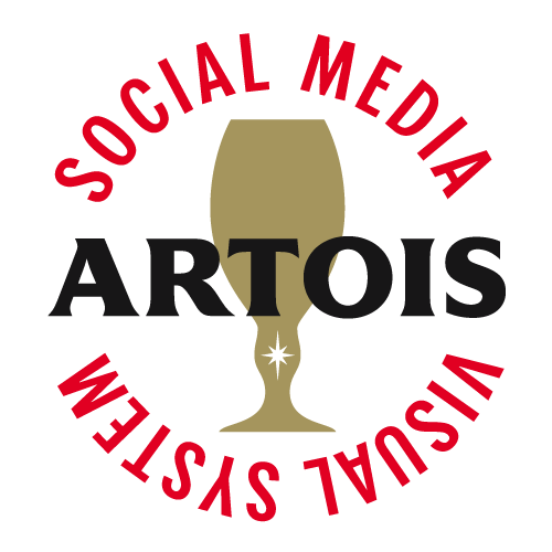
STELLA ARTOIS VISUAL SYSTEM
We designed a vibrant design system to captivate young audiences on social media, where emotions are expressed through visuals rather than words.
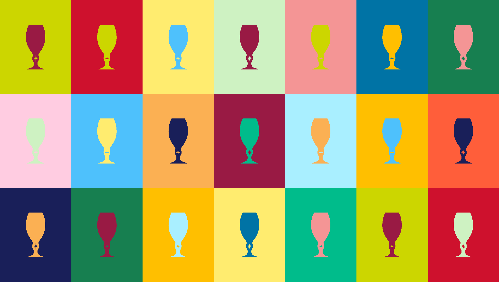
COLOUR
We base our visual system on four key emotions that define how we feel when we interact with others. Using colour psychology to bring our social content to life, delivering to every touch point a more dynamic brand that inspires and triggers feelings in its new consumers.


TYPOGRAPHY
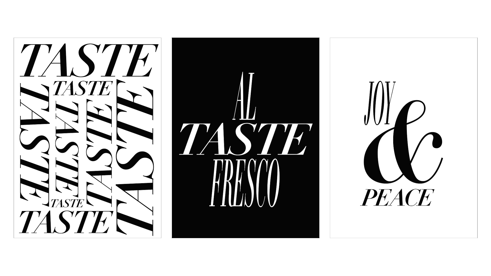
Typography is the second component of this visual system. We kept all the DNA of the brand and its classic fonts. Still, we expanded its limits to have more expressive gestures in our communication.


ICONOGRAPHY
Our most iconic shapes are the third element. We use all the traditional icons from the brand's core, the "Cartouche" logo, and utilize them as shapes to build our visual system templates.

Chalice
Cartouche
Star
Horn
Hops
Hops
Cartouche
Chalice
Star
Horn

SOCIAL CONTENT
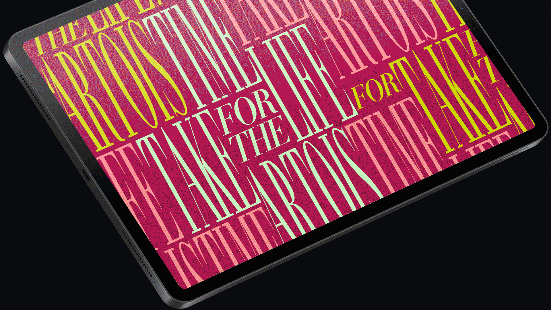
Using our pillars of colour, typography and shapes, we gave each photo, video and channel all the personality of an avant-garde, diverse brand full of engaging and dynamic content.
COLOUR + TYPOGRAPHY + ICONOGRAPHY

TEMPLATE SYSTEM

EXTENDED COLOUR SYSTEM
Now, let's see how the colour of emotions becomes part of the visual system, refreshing the brand in its day-to-day social agenda.


VIDEO
We use our visual system and motion graphics to ensure that every piece of content, regardless of the country it was created, has a graphic unity and is part of the same Stella Artois universe.


